
Henna. . .
Growing up in Pakistan, I was always submersed in a colourful and patterned atmosphere, one which I think has greatly influenced my tastes and preferences as an artist.
When I was 4, I was bridesmaid to the maid who worked for us and one distinct thing that I remember is the intricate henna which covered her body. This seemed amazing to me, however what struck me most was how she had hidden the initial of her husband somewhere amongst the henna for him to find on their first night together. I grew up surrounded by many differing values and traditions, but I think this is my favourite by far.


http://www.redesignrevolution.com/eco-monday-stencil-street-art-with-an-environmental-message/
I found this work when researching for my current brief on editorial illustration. Some of the concepts and issues being dealt with in the work are similar to those of my own and so I therefore found it extremely influence and inspirational to my own ideas.


Both of these artists were completely new to me and their polar differences have made me realise that I now appreciate 2 different aspects of Illustration. I can appreciate the indricacies and technical skill of Kate Mia Whites work, however I can also appreciate the narrative and witty humour of Philippa Rice's work.


 I would like to experiment with this effect using brush pen and dip pen and ink.


#


'The Village that slept' by Monique de ladebat was a book that my mum gave me when I was little and is still my favourite book. The book tells the story of 3 children stranded on a mountainside. It never really told how they ended up there, though for some reason I always thought is was to do with a plane crash. The children then go on to almost find their own civilisation in an abandoned village in the mountains and it tells the story of their lives for about 2 years before they are found and taken back home. When I was younger I read this book almost as if it were one of the stories my friends and I would make up when we played in the woods in my garden. However after re-reading it over christmas I read it in a completely different light and saw the perhaps harsh and sinister side of the story.


Swimming Elephant. . . .
I came across this image of a swimming elephant and it was such a strange concept to me at first. However the more I looked at it, the more I liked its humour and I can imagine it being quite striking as an illustration.
Swat Valley. .
This may look like the idyllic scenery of the Swiss Alps, but this is in fact the a place called Swat Valley in Pakistan. I spent several summers here during my time of living in Pakistan and I very vividly remember the vast and rugged landscape, however I would like to highlight how this beautiful place is only a hundred miles or so from Karachi, a huge, industrial and busy city. I like how 2 such polar worlds can coexist so closely. Spending time here also exposed me to other Pakistani traditions and ways of life.
Enviromental Graffiti and stencil art
http://www.redesignrevolution.com/eco-monday-stencil-street-art-with-an-environmental-message/
I found this work when researching for my current brief on editorial illustration. Some of the concepts and issues being dealt with in the work are similar to those of my own and so I therefore found it extremely influence and inspirational to my own ideas.

1984....
I read 1984 as part of my a-level english and since reading I have become increasingly aware of how little privacy there truly is in the modern world. I recognised this when my dad showed me a list of the names, adresses, ages and family position of everyone who worked for him; this list consisted of around 3000 people working in different positions in shell. It leads me to questions as to whether my generation should fight against it, or almost take advantage of this. People are increasingly using the internet ( a place with absolutely no privacy) to put across their views and opinions and to spread them. This is arguably the same with art with social network sights such as tumblr, pintrest and twitter. Should I join this weird digital crusade????
Berlin Traffic lights. . .
On my travels around europe during the summer I was struck by many things, however 1 thing that I vividly remember is the the traffic lights in Berlin.
This little red man looks like jesus on the crucifix .... The little green man looks a bit like Charlie Chapman

The Pantheon. . .
As I studdied classics when I was younger and History of Art in My a-levels, I have always had a keen interest in ancient architecture. I was always fascinated by the colosseum and the Acropolis in Athens, however when I was travelling around Europe, I found a new favourite, the Pantheon. This huge building is crammed into the smallest space in rome but it has such a dramatic and overwhelming effect when you walk into it. The space inside is huge and is glorified by the porthole of sunlight which fills the space. I can imagine that if you were a religious person in ancient roman times then coming into this room must have been an amazing and overwhelming experience.
'Thought Bubble' comic book and print convention...
This weekend I went along to the 'thought bubble' comic book and print convention. I've never really read or taken an interest in comics and so I was a little apprehensive at first; I was almost expecting to be dragged into talks about different super hero's I'd never ever heard of. However, although there was the odd comic-book-nerd I had to dodge I found myself being drawn to watching the different artists drawing and then looking at the finished artworks they had beside them. I found it really interesting watching their processes in making a picture and I found it really insightful.
Whilst I was there I also met and bought works off of 2 upcoming and entirely different illustrators, Kate Mia White and Phillippa Rice.
 |
| Kate Mia White |
 |
| Philippa Rice |
Sam Arthur and Nobrow. . .
On friday the 22nd we had a talk from Sam Arthur who set ups and runs Nobrow press, a publishing company which aims to publish informative and funny picture books for adults and children. I found it really interesting to not only learn about the different artists they work with and how they collaborate with them but also the unknown complications and facts about the publishing industry. One of the most interesting things I learnt was about how old lady bird books used to be printed in 1 single sheet for the whole book.
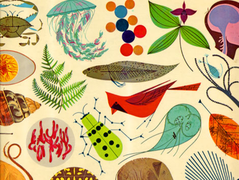
Charlie Harper. . .
One of the main things I discovered with the lecture from Sam Arthur was the 1950's Illustrator Charlie Harper who creaets simplistic and effective images using bold colours and shape. I really liked Harpers work even though it differs entirely to how I usually draw, however I aim to take on some of his methods in creating images.
Mary Emma Hawthorne
In sight of our next task in visual language being collage I decided to look up some collage Illustrators and found this one. Im not usually a fan of collage as I think it can be overpowering and a bit uncomunicative sometimes. However I really like the simplicity of this as well as the mix between drawing and collage.
'Dogger' -'Shirley Hughes'....
This was my favourite book as a kid and my mum still has and I think always will have a copy of it somewhere. It tells the story of a little boy and his toy dog. I love the loose and watery style of illustration and also the emotion in conveys and captures.
Shirley Hughes Illustrations. . .
I also like Shirley Hughes as an illustrator because I find her style loose, but also realistic, as well as being sensitive and emotive. I also admire how she illustrates her own stories; often a lot of children's book writers bring in an outside illustrator. However I feel that in illustrating her own work, Shirley Hughes has managed to capture much more emotion in her illustrations as she can directly identify with it as she wrote it herself.
'Screen printing. . . .
As part of both our 'visual language' task this week and our ongoing exploration into publishing and printing in 'visual narratives' we are looking at the process of screen printing. In sight of this I decided to have a look at some screen printing artists and their approach to the process and the different effects that can be achieved.

'Blexbolex illustration'
Blexbolex' is one of the artists working for 'Nobrow' press. I like his simplistic and impressionist style where he uses only simplistic and almost idealised shapes to create his images. I also like how the screen print combines both hand-made and digital textures.
'Robert Rauchenberg'
Rauchenberg is a screen print artist working in the 60's. I really like how he's combined the screen prints with other medias or printing techniques to create his images.
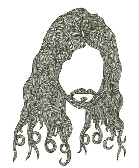
'Nicholas John Frith'
I like the simplicity of Friths work as well as the unusual use of bold and graphic colours. However what I like the most about this piece is how he combines the flat and graphic colours with the handmade texture in the beard. I think this is really effective and I hope to experiment with texture in my own work.
'Dumb ways to die' metro train campaign.....

'Dumb ways to die' is a metro train campaign by the Australian company 'Mccann' campaigning about rail safety both on trains and on the platform. The advert starts off a pure satyrical humour showing different and extremely unrealistic ways people could die such as eating superglue or selling both their kidneys. However it ends with how people could die quite easily in and around trains. I think the advert is effective because when it comes to the more serious point the tone doesn't alter or change and so there is an element of dark humour. I think this advert shows just how informative and emotive image making can be.
George Butler. . .
George Butler is an Illustrator I found whilst researching for both my visual narratives and visual language modules. He similar to Lucinda Rogers, however I like the subtlety and loose nature of his style. Furthermore I really like the perspectives of his drawings, some are drawn almost as if they have a 'fisheye' lense or are are quirky or slightly destorted angles.
Charlie sutton. . .
Charlie sutton is an illustrator based in the south west who recently graduated from Falmouth university. She specialises in animal portraits however it is her animal collages which I am most interested. I particularly like the way she sticks to one colour or one textured paper to create her animals and just varies the direction of the brush strokes or tone to create different parts of the body. From looking at the work I want to experiment with how using only 1 texture in different directions and tones could be used to create an image.


Charlie Gardiner illustrations.. . .
Charlie Gardiner is another practising british collage artist. Like charlie sutton he works with different shapes of hand made textures, layering and collaging them up to create an image. However his work is more layered and complex than Suttons. I really like how the handmade textures are realistic to the subject matter but still give a bold and graphic nature to the piece. From looking at this work I want to experiment with more layer and complexities to my collage work.


Helena Marie. . .'Bluefin Bonanza'. . .
In light of my current 'visual narratives' module I wanted to see how other artists/graphic designers had approached the issue of unsustainable fishing and endangered fish. I like how Marie has subtly combined photography, sketchy ink drawing and collage to create her work. Her images themselves are quite simplistic and I feel that her use of media conveys perhaps her anger of the issue and also the vulnerability of the fish.


Amy Isle Freeman. . . .
I really like the loose use of colour in this piece and also the unconventional use of pattern. I think it is effective and eyecatching. I also like how the colour and pattern is really loose and the pen work on top is controlled however still selective.
'Down Down Down', by Steve Jenkins. .
I really like how in most of his illustrations, Jenkins uses the same texture for all of his fish but varies the direction and tone of it to suit the different part of their anatomy. I also like how he varies the texture by doing this such as scrunching the paper or folding it up.
'Deep sea Farmer' by Dahlov Ipcar. . .
This is a book written and illustrated in 1961, I like the simplistic use of colour, geastural markmaking which evokes movement as well as the almost childish use of simplistic pattern.
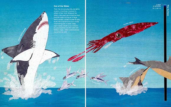
I would like to experiment with this effect using brush pen and dip pen and ink.Guy Harvey artwork. . .
Although I dont find his work particularly eye catching or interesting, I think Harvey manages to capture an extreme sense of motion and energy which I would like to reiterate in my own work.
Hugh Fearnly Whittingstall 'The great fish fight'. . .
I watched these videos as part of my 'Visual Narratives' research on the sustainabilty of fish. I found it really impactful and driving to actually watch the impact that commercial fishing is having on our sea beds and to the fish that inhabit it.
Bob Dylan, 'Face Value' exhibition. . .
On a recent trip to London I went to an exhibition at the national portrait gallery. There was a collection of charcoal drawings by Bob Dylan; the pictures were done from memory and with no reference and he had done them of people who had very distinct facial features which he had remembered. For example some of them had large or bent noses, others had small eyes or long faces. I found the concept of basing a portrait entirely around 1 distinct facial feature really interesting. I found that the feature wasnt dominant or overriding which you would expect it to be , it was more like it was a starting point for the rest of the piece.
Jonathan yeo portraits. . .
Another exhibition I saw at the national portrait gallery was that of Jonathan Yeo. Yeo almost has 2 styles and approaches to his work; One is almost photographic realism in his level of painting whereas the other evokes that of lucian Freauds work. I love both of these styles however what I find most interesting about his work is the way that the background to the figures(often including their hair and clothing) is much looser to the point where it almost looks as if it isnt finished.
aul Thurlby. .
I recently discovered the work of Printmaker Paul Thurlby. His work is arguably childish and almost quite simple. But I dont know if its his use of colour or the distressed effect in his prints but I find them quite charming and eye catching.
Embankment Bridge skateboards. . .
I've walked up embankment bridge about a thousand times and Ive never understood why people have thrown their broken skateboards and trainers over the edge and onto the feet of the bridge. I wondered if it was a cult thing or something but then I found out that the local kids who skate in the enbakment skate park throw their boards over everytime they either break their board or them move away from London.
Big heads with Eleni Kalkatori and Lizzy Stewart. . .
Today we had a skype call with 2 practising illustrators, Eleni Kalkatori and Lizzy Stewart. We talked to them about what it was like to be an illustrator not just in the sense of what work you receive but also with how they go about practising their work and what they get out of it. For example we talked to them about how they set out with every day working routine and whether or not they disciplined themselves to have a regular and structured working day or if they went about it differently. We also talked to them about things like what work they were currently doing as well as what work they had done that they werent happy with and why they werent happy with it. However the most interesting thing that I had got out of the talk was how Lizzy Stewart had commented that it was just as important, if not more, to do work for your own pleasure and own inspiration than commissioned work because it allows us to develop our practise with out being bombarded and crowded by the restraints of a brief. I also thought it was interesting how she said that as an artist you should listen to whatever advice of criticism you get but be strong enough to chose when to acknowledge it in your work. She said this because are is entirely subjective and just because one person has an opinion on it doesn't mean it should always be taken into consideration.
Eleni Kalkatori. . .

Lizzy Stewart. . .
Mr Bingo . . .
We recently had a talk from Mr Bingo, a practising illustrator who has been working in the industry for around 11 years. It was really interesting to hear how he had learnt, developed and made his way up the industry. It was specifically interesting how his jobs prior to becoming a full time illustrator have influenced his style of illustration as well as the concept of his illustration. His main focus is comedy which resinates throughout all his illustration. I really like the simplified , linear
quality to his work.
Leeds print festival
I recently went to Leeds festival and I found it really interesting looking at other printmakers and illustrators and how they went about their practice. It was also really interesting because I learnt about the business side of the illustration industry including how things were priced and how they went about selling things.
#
Michael Kirkham. .
On Thursday 5th of February we had a visiting Illustrator called Michael Kirkham come in to show us his work and to give us a lecture and QandA session with him. What stood out to me most about his lecture was how he told us about how his methods and processes of making work had evolved and progressed. This was not only in university but also in the years beyond. He was telling us of how when he left uni he became restricted by the processes which he could make work because he no longer had access to them and so this informed his work.
Lucinda Rogers. . .
Lucinda Rogers is one of my favourite discoveries over the last few months. I really like the combination of thick, fluid lines with the finer, more precise lines. I also love the way she uses colour paper in some of her pieces and her limited use of colour overall.
Robert Smithson. . .
In our recent COP lecture, the name 'Robert Smithson came up when we were discussing the outlandish and 'think-outside-the-box' attitude of post modern Artists. I really like Smithson's work for no other reason than that I think its beautiful and I like the way it almost enhances the beauty of the environment its set in rather than detracting from it. His artworks almost look like they are just phenomenons of nature.
Tamsin Nagel. .
Tamsin is an illustrator I found on 'Its nice that'. I think i like her because she chooses to deal with complex elements of nature in quite a simple and effect way. I really like her quite primitive mark making with the watercolour and pencils. I also really like some of her more precise work because it is almost diagramtic. I like the contrast between the diagram approach to her work to the quite loose and informal style of it.
Lorna Scobie. . .
I found Lorna Scobies work when I was researching Reportage illustration. I like alot of things about Scobies work, I like her use of textures in her choice of mediums such as coloured pencil and ink. I also think she is very clever in her use of selection in her pictures. I think this is a very clever and difficult thing to do and is something that George Butler does as well. Its where you select the key information and only show that in a scene; however its quite difficult to do this and still make the image look complete and make sense.
The Village that slept. .
 |
| Add caption |
Lucy Eldridge. . .
Lucy Eldridge is an illustrator that i've recently found and become really excited about and very inspired by. I love her layered application of the watercolour as well as the way she includes little moments of detail in her work. I also really like the simplistic formatting of her work. As someone who finds compositions so difficult, its nice to see that the simplest of compositions can achieve really good results.
Beijing Bicycles . . . .
I was recently strung along to watch a foreign film with subtitles, something I usually hate doing. This film was chinese, however my boyfriend A)couldnt find it with subtitles, and B) could only find it in german. So I ended up watching a chinese film in german with subtitles. Despite this however, I actually really enjoyed the experience; as I didnt have any text or language to follow I was focusing much more on the scenes themselves and their content. This included the emotion played coming from the characters, the compositions of the scenes and also the music in the film. So despite not actually being able to understand a word of what any of the characters were saying, I could actually follow the film quite well just from focusing on these other factors.
Sarah Maycock. .
I was introduced to Maycocks work by another student. I really like her process of ink and watercolour washes teemed with moments of detail. In some of her works such as her bear I admire the minimalist but decisive huge brushstrokes.
Margory Gill Illustrations. .
Margory Gill was an illustrator who worked in the 50's mostly doing covers and illustrations for children's books.
She studdied etching and engraving at the Royal college of art before going on to teach at Maidstone College of art alongside David Hockney. I really like her minimalist by highlighting use of colour in her work as well at the expression created by the lines in her etchings or ink drawings.

William Grill Illustrations. .
Will Grill is actually someone I went to secondry school with. He was in my brothers year and so has only been out of university for 2 years! I really admire both what Will has achieved so far but also the processes of his work. I really like the texture that using coloured crayons creates. One thing that I really like about Wills work is his compositions; they are really simple but I like how they all apply a narrative to his pieces.
Matt Saunders. .
I went to a talk from Matt Saunders, a practicing Illustrator/ Animator and Art Director. It was really interesting listening to the ways Matt was talking about how pieces of work as all linking together and different disciplines being combined. It was really interesting to see how different illustrations came to life through his animations or 3D work. It was also really interesting to listen to him talking about how his work process has evolved. He was talking about how he came out of uni feeling in a bit of Limbo with his work and how it wasnt untill he did an unpaid commission for a poster for 'The Cure' that his now definiting style came to life.
What also came to light for me was the idea of 3D illustration and the idea of bringing something to life outside of the page. I would like to experiment with 3D illustrations in my own work.
3D Illustrations. . .
From looking at Matt Saunders work and also from the current Visual communications module we are doing, I really like the idea that Illustrations can be brought to life beyond the page. I would like to experiment with model making and perhaps creating little scenes to create a narrative rather than just simple drawings.
Harry Potter concept Illustrations. .
Over Christmas I went to visit the Harry Potter studio tours. I really enjoyed the experience but the main thing that stood out for me was all the concept illustrations and development work that came with the building of the sets and the animations. This was an eye opener for me because it was a part of illustration that I didnt even think existed. Its also a side of Illustration which I feel like Id like to be more directed towards.
Pat Bradbury. . .
Pat Bradbury came in and sat in on one of our workshops as well as talking to us about his work and practice. Although I am interested in the idea of using shape in an image I wasnt overly keen on Pats work. However I was really interested in the work he did when he worked as a teacher in an international school in Vietnam. I think it was amazing that he was almost thrown into working with small children and their quite primitive and basics styles. I think it was particularly interesting about how his work evolved from that and how the idea of shape and colour became even more definitive to his style because of all the work he did with the kids. Listening to Pat talk about his work and lifestyle whilst he was out in Vietnam was really inspirational to me as it is something I would like to do myself since I will only be 20 when I finish my degree.
Ben Newnham and Jim Stotam . .
We had a Big Heads talk with Ben Newnham and Jim Stotam recently, two practicing commercial illustrators. They were really interesting to talk to and gave us all a good and reslistic insight into the life of a practicing illustrator. I really like the way Newnham uses geormetric shapes in his work, its something interesting to look at and to take into consideration for out recent Visual Communications brief on Vectors in Illustrator.
BEN NEWNHAM. .
JIM STOTAM. .
Kristyna Backzynski. .
We recently had a talk from Kristyna Backzynski, a local, professional illustrator and designer. Kristyna specialises in comics and zines, something which I wouldnt say I'm entirely in to. However she actually changed my opinion of then slightly because her comics drew on something I am actually quite interested in myself, folk art and stories. I really liked the way Kristyna used colour in her work; most of her pieces use a reduced colour palette or just simple spot colouring and I think this was really effective when trying to tell a sequential story.
From listening to and talking to Kristyna I've actually started drawing upon one of her processes where I fill a page with as many different variations of the same thing. I think its really good practice for drawing as well as it forces you to perhaps think of different ways you could draw something.
Sandra Dickmann. .
Sandra Dickmann is fairly low key illustrator however I really like the way she uses colour, pattern and line in her work. I think it gives quite a realistic effect however she still manages to create quite a magical and fantasy element to her work as well. I really like how her images evoke so much texture through her use of texture.
Matt Taylor illustration . . .
In our last visual language session we were discussing the use of colour, tonal value and opacity, something which I hadn't fully considered before. I had always used colour to create a specific mood or atmosphere but I had never really considered it as a tool in composition. I think its really interesting how we can use colour to draw and direct the viewers eye in a picture. I think this is particularly interesting in Matt Taylors work. I really really like his use of a very reduced colour palette. He sticks to using only very few colours that complement and contrast each other. He uses colours as a way to create tone and atmosphere, but also in a way that draws the viewers eye to a certain area or along a certain line.
Ice Harvesters. . .
For some strange reason I have recently become really fascinated by Ice harvesting, in particular that done in the victorian era. Although the concept dates back to roman times, I am most interested in how it was done in the victorian era. Ice harvesters would go out onto great plains of ice during the winter months and systematically cut and haul each individual block of ice. These blocks of ice were then hauled onto a sledge and transported to where it was kept stored in ice houses for the warmer months. I think what draws me to this subject is the idea of going out into an ice wilderness and then also the rhythmic labour of cutting up the ice and hauling it onto the sledge.
Adam Hancher Illustration. .
Adam Hancher is an illustrator I found when I was looking for different colour palettes I could use in a visual language piece. I love the way Hancher creates texture and atmosphere in his work through his use of opacity in colour and the mark making he does. His work looks like it is done in analogue, however I think the separate components were done by hand and then scanned in and composed on photoshop. I like the way Hancher uses a limited colour palette in his work but also accentuates the separate elements by putting dark on light and light on dark.
Eiko Ojala illustrations. .
I came across Eiko Ojala's work when researching for my visual language project. However I think that her texture and the 3d element to her work could be really useful for my cop project. I think Ojala's work is extremely well crafted. fluid and beautiful.


Alexander Wells illustration
Alexander Wells is an illustrator I found on pintrest. I think his work is similar to Matt Taylors but I think it includes more line as well as shape. Like Matt Taylor, I really like his use of colour to create atmosphere and drama in his work. I really like the process of both Wells and Taylors work and I really want to look further into and practice more the process of hand drawing an image and then scanning it in to colour it on photoshop.
Homers Odessey. .
I read the odessey as part of my classics and latin GCSE as well as the Aneid and the Illiad. As well as art, classics and latin was my favourite subject at school and I still remember alot of the chapters such as when Odysseus encounters the cyclops in the cave and he feeds sheep to him to protect himself. Also when he encounters the phaecians on their island and they hurl rocks at his boat.
A lot of the chapters and scenes in this book are full of energy drama and tone which I think could translate so well into illustrations.
What alot of people dont realise that storylines and scenes that are in the Odyssey are actually included in a lot of films.
Daniel danger illustration.
Daniel Danger is another Illustrator I found on pintrest. I really like the way he creates a spooky atmosphere with his limited colour palette and strong lighting. I also really like the hand made textures he uses. These are not only in the drawings themselves (such as the texture of the grass, floorboards and the wood of the buildings) but also in the ink washes and paint textures he incorporates into the background.
Chesterfield church. . .
furthering on from Looking at Daniel Danger, on a train journey I went past Chesterfield and noticed that its church spire was wonky and twisted. It was bent almost like a witches hat and it was almost quite spooky. Looking at this reminded me of Daniel Dangers work and I thought it could be made part of a spooky illustration.
The Amish. . .
The Amish culture is something that Ive always been really interested in an curious about. It goes from their principles such as when young people hit their 'running around years' where they decide whether they want to be officially baptised into the Amish faith, to their principles behind courting and marriage.
ELLY MCKAY . . .
I looked at Elly Mckay for my 3D COP project when I was looking at the little houses. I really like the distance and atmosphere created with the layered papers.
Old railway posters. .
recently Ive become more and more interested in the old railway posters that were used as campaign posters during the 50's and 60's to promote the use of the railway and also tourism.
Ive become increasingly interested in these because I really like the use of colour and shape in them. Originally they were created using paint, however I really like the way that some of the artists have used a very minimal colour pallete.
I also love the lineless quality of the image and the use of shape more than anything. I think this really enhances the use of colour in the images because their is not lines separating them out.
Steven Thomas. . .
Furthering from this research, I wanted to look into some contemporary practitioners who work in this way.
I really like the sense of perspective and use of lighting in Thomas' work.
Page Tsou. . .
I found this illustrator just while I was scanning through pintrest. Although not alot of her work particularly grabs me, I really like her work on collections and repetitions. Its just simple sketchbook work but I think its a really good form of research and development to get deeper sense of the subject.
No comments:
Post a Comment